This guide lays out all of the CSS styles used throughout the kit. It includes specific directions on using text styles, product cards, and wrappers.
Headline styles
Text styles
Colors
buttons
paragraphs
Product Cards are the main building part of every store. So to give you maximum flexibility Product grid cards are coming with S, M, L, XL combo classes. This is particularly handy when filling your CMS with landscape or portrait pictures. Don't forget that you can always go with different number of columns. Recommended number of columns is 1 to 4 for the optimal experience.
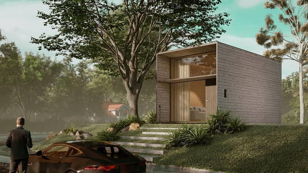
With the creation of his first product in 1993, Pablo established a powerful and generative design philosophy. Since then, his core principles have informed the development of every light in the studio’s 25-year history. These products continue to move with culture while withstanding trends in design — and each one carries the underlying uniqueness that is distinctly “Pablo.”
With the creation of his first product in 1993, Pablo established a powerful and generative design philosophy. Since then, his core principles have informed the development of every light in the studio’s 25-year history. These products continue to move with culture while withstanding trends in design — and each one carries the underlying uniqueness that is distinctly “Pablo.”
With the creation of his first product in 1993, Pablo established a powerful and generative design philosophy. Since then, his core principles have informed the development of every light in the studio’s 25-year history. These products continue to move with culture while withstanding trends in design — and each one carries the underlying uniqueness that is distinctly “Pablo.”
With the creation of his first product in 1993, Pablo established a powerful and generative design philosophy. Since then, his core principles have informed the development of every light in the studio’s 25-year history. These products continue to move with culture while withstanding trends in design — and each one carries the underlying uniqueness that is distinctly “Pablo.”
With the creation of his first product in 1993, Pablo established a powerful and generative design philosophy. Since then, his core principles have informed the development of every light in the studio’s 25-year history. These products continue to move with culture while withstanding trends in design — and each one carries the underlying uniqueness that is distinctly “Pablo.”
With the creation of his first product in 1993, Pablo established a powerful and generative design philosophy. Since then, his core principles have informed the development of every light in the studio’s 25-year history. These products continue to move with culture while withstanding trends in design — and each one carries the underlying uniqueness that is distinctly “Pablo.”View other Projects
Text Styles - Combos
As we know now, there are 7 types of text classes for working with you typography. To easily align all your typography in the sections every text class comes with a combo class clearing the margins coming from the main class. As you can see on the example below there is Bottom Clear which removes the Bottom Margin, Full Clear for setting both margins to 0 and Top Clear is great for aligning headlines to the same level as paragraphs.
Rich Text
The rich text element allows you to create and format headings, paragraphs, blockquotes, images, and video all in one place instead of having to add and format them individually. Just double-click and easily create content.
A rich text element can be used with static or dynamic content. For static content, just drop it into any page and begin editing. For dynamic content, add a rich text field to any collection and then connect a rich text element to that field in the settings panel. Voila!
Headings, paragraphs, blockquotes, figures, images, and figure captions can all be styled after a class is added to the rich text element using the "When inside of" nested selector system.
Bold
Italic
Headings, paragraphs, blockquotes, figures, images, and figure captions can all be styled after a class is added to the rich text element using the "When inside of" nested selector system.
Cards
Product Cards are the main building part of every store. So to give you maximum flexibility Product grid cards are coming with S, M, L, XL combo classes. This is particulary handy when filling your CMS with landscape or portrait pictures. Don't forget that you can always go with different number of columns. Recommended number of columns is 1 to 4 for the optimal experience.

